Key takeaways
- Vanity metrics (like bot counts) erode executive confidence; focus on outcomes.
- Balance financial, operational, compliance, and experience dimensions.
- Design dashboards in layers: executive summary, drill-downs, and operational health.
- Denominators matter—always show scale, baselines, and variance.
Dashboards are political tools; anticipate the dynamics they will trigger.
Executives have a love-hate relationship with dashboards. On one hand, they promise clarity—one page, a handful of charts, and an instant sense of whether things are working. On the other hand, anyone who’s sat in a boardroom has seen how these dashboards often fail: too much noise, not enough insight, or metrics that don’t actually matter.
When the focus shifts to automation programs—such as robotic process automation (RPA), intelligent document processing, and AI-driven workflows—the stakes get even higher. Automation initiatives are expensive, politically sensitive, and often sold with the promise of quick ROI. If the dashboard doesn’t track the right impact, leadership either loses confidence or doubles down on the wrong things.
So, what does a genuinely useful automation impact dashboard look like?
Also read: How to Align Automation with Strategic Business Objectives
Why “vanity metrics” quietly kill automation credibility
Many automation leaders fall into the same trap as marketing teams once did: focusing on activities rather than outcomes. You’ll see dashboards with:
- Number of bots deployed
- Automation hours executed
- Processes automated
They look impressive, but do they answer the board’s actual questions? Not really. A CFO doesn’t care if you’ve automated 100 processes if those processes barely move the financial needle. A COO won’t celebrate 10,000 “bot hours” if customer complaints are rising.
Executives want impact visibility, not activity reporting. The difference is subtle but profound.
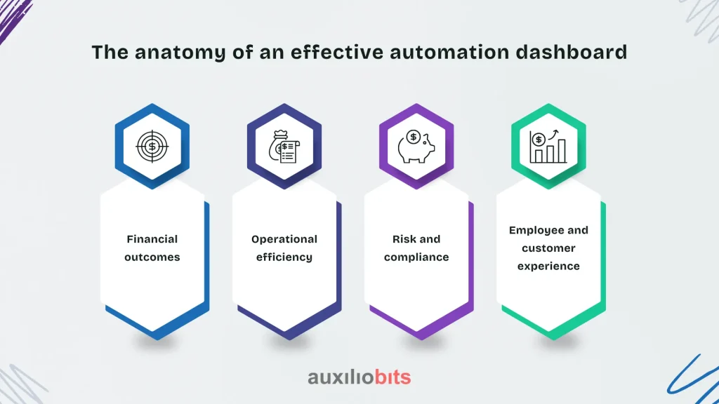
The anatomy of an effective automation dashboard
There’s no universal template—any consultant who tells you otherwise is oversimplifying. But strong dashboards usually balance four categories:

1. Financial outcomes
- Cost reduction (FTE savings, reduced outsourcing spend)
- Revenue enablement (faster quote-to-cash, fewer lost sales due to delays)
- Margin improvements
2. Operational efficiency
- Cycle time reduction (order approvals, claims processing, vendor onboarding)
- Error rate reduction (how much rework was avoided)
- Throughput or capacity gains
3. Risk and compliance
- Audit trail completeness
- Policy adherence rates
- Regulatory breach prevention (e.g., percentage of KYC checks automated correctly)
4. Employee and customer experience
- Reduction in manual, repetitive work (survey-based, if you can get it)
- Customer wait times
- Employee redeployment rates into higher-value roles
Notice what’s missing? “Number of bots.” That belongs in a program manager’s dashboard, not an executive one.
A common misstep: tracking automation like IT uptime
Too often, automation dashboards are modeled after IT service monitoring—uptime, error counts, and system latency. Useful for operations teams, meaningless for executives. The board isn’t concerned if the automation platform had 99.9% uptime last quarter; they care if those automations actually accelerated invoice collections by 15 days.
This distinction seems obvious on paper, but in practice, automation leaders still overload executives with technical metrics. It’s a defense mechanism—more charts give the illusion of transparency. Unfortunately, they also obscure what really matters.
Case example: A global manufacturer’s RPA dashboard gone wrong
One multinational proudly displayed a “bot army” dashboard to its leadership team. It had pie charts of bots per department, trend lines of scripts deployed, and a giant ticker of hours saved.
The CEO asked a simple question: “So, has our order-to-cash cycle improved?” Silence. No one could answer.
The dashboard was technically accurate but strategically irrelevant. Within six months, funding for the automation program was cut in half. The message was clear: don’t confuse automation activity with business performance impact.
When to go broad, when to go deep
Another nuance: executives don’t always want “high level.” Yes, they need summary KPIs, but in moments of pressure—say, when margins are falling—they want to drill into the details. A rigid one-page dashboard that can’t expand into supporting views is just as problematic as one that drowns them in data.
A layered design often works best:
- Level 1: A concise executive view (the three to five metrics that actually move strategy).
- Level 2: Drill-downs for each metric (cost savings by business unit, error reduction by process).
- Level 3: Operational health for program managers (bot uptime, queue status, technical debt).
This way, the CFO sees what matters at a glance, but if challenged, the automation lead can walk down the layers without losing credibility.
The hidden art: choosing denominators
One of the most overlooked dashboard design choices is the denominator. For example:
- Reporting “$5M saved” sounds good—but what if total spend is $10B? That’s 0.05%.
- Saying “20 processes automated” means little—unless those processes represent 60% of the back-office workload.
- “Average cycle time reduced by 3 hours” matters more if the process originally took 4 hours than if it took 4 weeks.
Executives think in relative terms. Raw numbers without context get dismissed. Always anchor metrics to scale, baseline, or strategic importance.
Beyond numbers: storytelling matters
Numbers alone rarely change executive minds. Framing matters. For instance:
- Instead of “automation reduced invoice processing time by 30%,” try “We now process invoices fast enough to capture early-payment discounts worth $2.3M annually.”
- Instead of “automation saved 200 FTE hours per week,” try “Finance analysts now spend Mondays analyzing trends instead of re-keying data. That means faster insight delivery to leadership.”
A good dashboard blends quantitative metrics with narrative anchors—short, contextual callouts that link performance to strategy.
Dashboards as political tools
Dashboards shape perception, funding, and executive trust. A poorly designed one can sink a transformation program, not because the program itself is failing, but because leadership believes it is.
Automation teams often underestimate this. They think of dashboards as neutral reporting tools, when in reality they’re political artifacts. Who gets the credit? Which department’s processes look inefficient? Why did savings appear in one cost center but not another?
If you don’t anticipate these dynamics, the dashboard may trigger resistance instead of support.
Practical design principles that help avoid dashboard challenges
Here are some of the major principles that help in getting rid of dashboard challenges:
- Limit to five key metrics on the executive landing view. Any more, and focus evaporates.
- Use trend lines, not just snapshots. Executives need to see direction, not one-time status.
- Balance leading and lagging indicators. Cost savings (lagging) paired with adoption rates or error prevention (leading).
- Highlight variance from the target, not just absolute values. A $3M saving sounds good, but if the target was $5M, that’s a miss.
- Make it consumable in three minutes. Most executives will never spend more time.
Notice these are not aesthetic guidelines about chart types. They’re about making the data decision-ready. The prettiest dashboard is useless if it doesn’t answer the right questions fast.
Pitfall: “dashboard first, strategy later”
It’s tempting to build a flashy dashboard as proof of progress. The danger is that it starts dictating what you measure, rather than the other way around. I’ve seen teams pick metrics simply because they’re easy to track in the automation platform.
That’s backwards. The strategy defines the metrics, and the metrics define the dashboard—not the reverse. If the organization’s goal is to reduce days sales outstanding (DSO), then the dashboard must connect automation initiatives to DSO improvements, even if it requires messy integration with finance data.
What makes automation metrics uniquely tricky
Unlike sales or operations, automation programs are cross-functional by design. Savings in HR may show up as capacity, not reduced headcount. Compliance improvements might be invisible until an audit. Productivity gains may manifest as “avoided hiring” rather than actual cost out.
That’s why dashboards for automation impact require more interpretation than most. They often need proxy metrics, like:
- Overtime reduction instead of headcount elimination
- Throughput increases instead of dollarized cost savings
- Employee satisfaction scores as indirect evidence of productivity improvements.
The trick is to acknowledge these nuances openly. Pretending every metric is precise undermines credibility. Executives respect transparency more than artificial exactness.
Technology considerations
Of course, dashboards live on platforms—Power BI, Tableau, Qlik, and even embedded modules in automation suites like UiPath Insights. The tool matters less than the governance. Two rules stand out:
- Single source of truth. Pulling financial impact directly from the ERP or data warehouse carries more weight than numbers “from the automation team’s spreadsheet.”
- Automation vs. enterprise metrics. Avoid isolating automation data in its own silo. Executives prefer to see automation impact side by side with enterprise KPIs.
One challenge: automation vendors often push their native dashboards as turnkey solutions. They’re fine for operations but rarely sufficient for executives. A hybrid approach—operational data in the vendor tool, strategic metrics in the enterprise BI stack—usually works better.
A question: what shouldn’t be on the dashboard?
If you’ve ever sat in a meeting where 20 KPIs are listed, you know the paralysis that follows. Some things simply don’t belong on the executive view:
- Bot utilization rates (that’s an ops concern)
- Technical error counts (unless they materially impact outcomes)
- Pipeline of future automations (better for a steering committee deck)
Clutter is the enemy of impact. Every extra chart reduces the attention given to the ones that matter.
The “so what” test
A useful litmus test for any dashboard element is this: If this metric changes by 20%, does an executive change a decision?
- If yes, keep it.
- If not, remove it.
Conclusion
Dashboards for automation programs aren’t just measurement tools—they’re trust instruments. A CFO reading them is not looking for technical reassurance but for proof that automation is tied to business results. A COO scans for operational leverage, while a CHRO wonders whether employees are actually being freed up for more valuable work. If the dashboard fails to answer these questions, the entire automation narrative unravels.
What separates the strong from the weak isn’t design polish or the number of charts. It’s whether the dashboard tells an honest, contextual story about impact—one that leadership can act on. If executives change decisions when a number moves, the dashboard is doing its job. If they glance at it, nod politely, and move on, it isn’t.
The irony is that automation, which promises clarity and efficiency, often drowns in its own complexity. A well-crafted executive dashboard cuts through that noise. It doesn’t hide challenges but frames them against strategic outcomes. That’s where automation programs gain credibility—and where they move from being side projects to being central to enterprise strategy.


